I have now created a questionnaire regarding the poster and its design/layout etc. This is the link for people who want to take it.
http://www.surveymonkey.com/s/H3K3SQ3
PG
Do not view this website in Internet explorer, otherwise the drop down menus won't work!!
Showing posts with label Poster research. Show all posts
Showing posts with label Poster research. Show all posts
Tuesday, 29 March 2011

Sunday, 20 February 2011
Visual poster feedback
OK so basically, I thought Conor and I would visualise for Patrick what our feedback on his poster, and how adding a little bit of colour and an action shot could do there first draft of a poster.


So obviously this was done very quick just as an example, to show the others. But we think just the tiny but of colour we have added to this poster, gives it just that little bit extra that it was lacking.
we havent fully managed to show what we mean by having the red flashing light at the bottom ( like the flashing light you see in films with bombs).. we wanted it so that it would give some glow.. to the 'Summer 2011', which we havent quite managed in this quick attempt, but we hope they will get the idea of what we mean.. If they did think it was a good idea.. obviously it would be done alot better, than me just using shapes..
Also the action shot image of someone running, kinda works, but somethings not right about it.. we wanted it too look like the runner was coming out of the shadows.. but we're sure we can get a better picture for that, but we defiantly think its better than just having lots of text there.
At the moment, we think this draft lacks emotion, so that the audience aren't drawn into the tense emotion that the film is about, As we mentoioned about in the post about unstoppable so we think on how to improve this we could add real emotion to the poster.
Yours Faithfully - I hate that it makes people sounds like they are servants. MS and CW


So obviously this was done very quick just as an example, to show the others. But we think just the tiny but of colour we have added to this poster, gives it just that little bit extra that it was lacking.
we havent fully managed to show what we mean by having the red flashing light at the bottom ( like the flashing light you see in films with bombs).. we wanted it so that it would give some glow.. to the 'Summer 2011', which we havent quite managed in this quick attempt, but we hope they will get the idea of what we mean.. If they did think it was a good idea.. obviously it would be done alot better, than me just using shapes..
Also the action shot image of someone running, kinda works, but somethings not right about it.. we wanted it too look like the runner was coming out of the shadows.. but we're sure we can get a better picture for that, but we defiantly think its better than just having lots of text there.
At the moment, we think this draft lacks emotion, so that the audience aren't drawn into the tense emotion that the film is about, As we mentoioned about in the post about unstoppable so we think on how to improve this we could add real emotion to the poster.
Yours Faithfully - I hate that it makes people sounds like they are servants. MS and CW
Unstoppable poster
Furthering our research on posters I thought I would take a look at a Similar kind of storyline, well in the fact that its got the possibility of killing millions and that they have to try and stop it!..
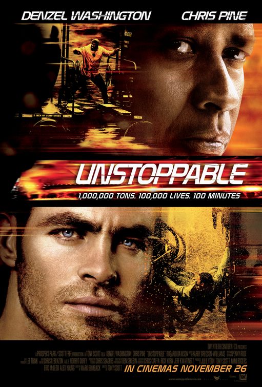
 I really like the colours they have used on this poster, to me it shows a real tense action film. Whilst also drawing the audience to look at the poster, in like the same way, people are drawn to look at fire, where you just have to look at it.
For the title which is in the middle of page, which is unusual for what I have seen. But it is cleverly done, as if it is a speeding train on fire, clever!..
As what seems the norm in lots of posters I've seen the main characters are at the top.. In the same font as the title
The images used are enthralling and exciting, mixing the main characters (clearly with loads of make up and photoshopped) up with the action shots, the use of the characters not only show who they have managed to pay to do be in the film, but it adds emotion to the poster, which draws the audience into the story. And as its based on a real life story (apparently). It gives a more appealing look rather than just a top production company doing a big explosive film.
And has all the writing no one reads at the bottom.. Along with the due date..
Thats all from me for now folks. MS
For the title which is in the middle of page, which is unusual for what I have seen. But it is cleverly done, as if it is a speeding train on fire, clever!..
As what seems the norm in lots of posters I've seen the main characters are at the top.. In the same font as the title
The images used are enthralling and exciting, mixing the main characters (clearly with loads of make up and photoshopped) up with the action shots, the use of the characters not only show who they have managed to pay to do be in the film, but it adds emotion to the poster, which draws the audience into the story. And as its based on a real life story (apparently). It gives a more appealing look rather than just a top production company doing a big explosive film.
And has all the writing no one reads at the bottom.. Along with the due date..
Thats all from me for now folks. MS
Wednesday, 9 February 2011
film poster research

As our genre of our teaser is action/ thriller there was one thing which came to my mind researching an actual film poster and that is Casino Royale.
This is a really good poster to look at for many reason. Every aspect of this poster works means something and the attention to detail makes this poster work so well.
So we first see the Facial Expression it looks quite intense, serious and a face of thunder which means business. Bond is dressed in a stereotypical bond outfit. But it also a loose tie which might mean that is going to become a rebel and not play by the rules. He is seen as a focused guy on a mission and he wont stop till the task is done. His body language is not directly at the audience but more to the target and looks like a man to not mess around with. He doesnt look happy and he looks determined to get the job done which we can see through his facial expression and his carrying of the gun.
We also see the Bond Girl in the background. As other films he always has his lover for the film but she isnt you typical Bond girl. She looks serious and seems to be a character who isnt easy to work out if she is playing Bond or helping Bond. But looks like she will play a big part in Casino Royale.
It also has the release dates and the credits at the bottom telling us who produced this film. It has the movie company also put in on the bottom right. It shows that there has been a lot of detail put into making this poster. Covering a lot of the aspects which made it so successful in advertising Casino Royale.
Tuesday, 8 February 2011
Ancillary Task- Teaser Poster

I have created a teaser poster for our film "Repurcussions". This is just a rough draft and will be ammended later on.
What does it show?
We can see a shot of the City of London at night. It contains several iconic elements such as Houses of Parliament, Big Ben and London Eye. The title of the film is written in big bold white writing contrasting with the scene at night. We put the credits at the bottom in small font so it does not impact on the image. It also shows the release date which is Summer 2012 and will be specific nearer the release date. The early tagline is also included.
What effect do these things have?
The effect of the iconic images states the location clearly and gives the film a sense of time and place. It is serene and clam which is in contrast with the catastrophic events that will occur later. The use of white is clearly states the taglines which make the apocolyptic tagline stand out as well as clearly state the title. This is an early draft but the genre is made clear through the tagline.
PM
Sunday, 6 February 2011
Poster Research

As I have recently analysed the inception teaser I thought analysing the inception poster would make sense in preparation for our ancillary task.
What does it show?
We can see the 6 main actors standing in the middle of an American street. The road behind them suddenly directs upwards rather than flat as normal. The title of the film is written in big bold red writing across the bottom of the poster. The lighting seems to be quite bright behind them and as you get closer to the front it gets much darker. It also shows the release date.
What effect do these things have?
By having the lighting change across the poster has the effect of directing your eyes towards the title of the film. The title has been written that large as this is arguably the most important content in the poster as they are trying to sell the film to people. Also the use of perspective and lighting both subliminally make us look towards the bottom of the image where the title is. I think it is in red to stand out and also due to the fact red symbolises many different emotions. The fact they are holding guns is the only hint to the fact it is an action film.
What can I take from this?
The title is the main focus being very big and is in a different colour to stand out from the image behind it. It shows the main characters of the film, in a location used in the film.
PG
Sunday, 30 January 2011
The Other Guys Poster
So basically we've been to start on our ancillary tasks, Our group has chosen to do a website and a poster.. So where better to start my research than with The Other Guys, which has a similar genre to ours, apart from The Other guys is also a comedy.. which I wish ours was!..
So Here is the poster you can click on it to a full size view of it..

So Here is the poster you can click on it to a full size view of it..

What the poster includes:
Title of the film - In a white bold font, which is easily noticeable as it stands out from the background.
Title of the film - In a white bold font, which is easily noticeable as it stands out from the background.
A large action shot picture in the centre of the poster. The eye catcher. The picture shows that the film is an action film without needing to say, but also a comedy by their positions and by the expression on the man in the grey suits face..
Famous actor names-the main characters in black font standing out from the background at the top of the poster.
Date of the film - Again white font what stands out in its background nestled between the companies involved and the website.
Tagline- One of 2 bits of the poster which actually has a colour. Which makes it stand out from all the text whats around it. It also gives a little taste of what the film about, in just a few words, in a way what suits the genre.
Website:.The poster has a link to a website, although this is very small and just nestled with all the company logos at the bottom of the poster. However the design of the poster has decided to focus on directing people to there page on facebook. Which suggests that more people are likely to go on their facebook site than go to the website. Thus suggesting the type of audience what might be interested in it..
Colours:. The poster mainly uses dull colours, apart from the red tie and the yellow tagline. The background is like a linear gradient going from light at the top to dark at the bottom.. with a smoke effect. As if its that action shot where an explosion has just happened behind them what you see in many action films where explosions happen.
We can defiantly take aspects of this poster for use in ours, the positioning, the colours, whats included etc.
Subscribe to:
Posts (Atom)